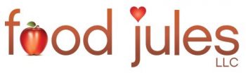
My dear friend, whom I’ve known for years and worked with in the past, was so kind in designing a logo for Food Jules. She is an amazing graphic artist and has done a remarkable job, yet again. I am very grateful to you, Jane, for all of your help and patience with this adventure of mine.
All of the logo renditions were great. Here are the final two picks. I need your help in deciding which one works best for the business. So, cast your vote by April 9th and be part of our official logo design.


the first one , with the letter L, the other one is hard to read
I love both but I vote for option one, I agree with Chris
YOur friend did a great job, very talented!
I like option 2. How exciting!!
I agree with Chris, go with option 1
I vote for #1. I really, really like the whisk but I think it breaks up the consistency of the image too much.
Option 1
Option 2! Love the wisk 🙂
Both are great, I vote for #2.
I love them both. Although I think that option #1 would be the easiest to read.
you could put the wisk at the end, as an exclamation point!
My vote is for option one!
They are both very nice but I like the first one more!
the second option
I prefer #1 — the 2nd one breaks up the word because it is hard to define the wisk. Chris has a good idea to use the wisk as an exlamation point!!!
I love #2 🙂
I vote for the second! I love the wisk, super cute! I like symmetry – and that way both words would have an accent:)
I vote for #1. Both are really awesome, but #1 catches my eye more. I am enjoying your site. ❤
I love them both! I like the idea of the whisk on the end! I think if i had to choose, it might be #1 to see it clearly.